Styling Players
Some basic player styling options can be configured using the Players module. For complete customization of the Brightcove Player, you need to use Cascading Style Sheets (CSS). For more information on using CSS to customize the player appearance, see the Step-by-Step: Player Customization developer document.
To configure the player Styling settings, follow these steps:
- Open the Players module.
- Click the link for the player you want to configure.
- Click Styling in the left navigation menu.
The following style settings can be configured:
After any changes have been made, make sure to Publish the player for the changes to be visible.
Playlist type
The Playlist Type setting controls the how the playlist is displayed. This option will only appear if Player Type is set to Playlist as part of the Player Information properties. The following options are available:
- Horizontal Playlist - Player will display a horizontal playlist
- Vertical Playlist - Player will display a vertical playlist
- Hidden Playlist - The playlist will be hidden
Title and description
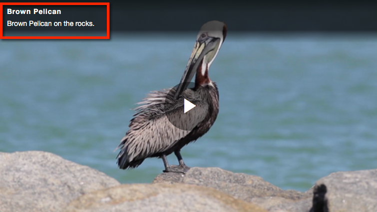
Select Show title and description to display the video title and description on the player.

Play button shape
The Play Button Shape setting controls the shape of the play button. The following shapes are supported:
- Circle
- Square
- Rectangle
Play button position
The Play Button Position setting controls the location of the play button within the player. The following positions are supported:
- Center
- Top Left
- Top Right
Color theme
The Color Theme settings control the colors used in the player including the play/pause buttons, elapsed time and volume, captions, full screen and sharing icons.

The following theme colors can be configured:
- Main - Controls the color of the big play button, progress bar and volume level
- Background - Controls the background color of the player controls
- Icons - Controls the color of the arrow in the play button and the icons in the player control bar
To change a theme color:
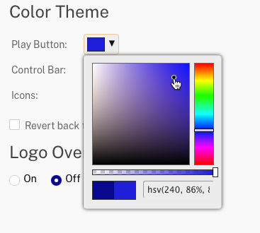
- Click a theme color to open the color picker.
- Click a color on the ride side of the control.
- Click in the square to select a shade of the desired color. Color can also be set using the hue, saturation, value (HSV) color model into the text control.

- The slider below the color square can be used to set the opacity of the controls.
- Click outside of the color picker to modify another theme color.
Logo Overlay
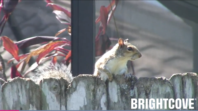
A logo overlay is an image that appears on top of the player. A sample logo overlay appears below.

To add a logo overlay:
- Set the Logo Overlay to On.
- Click and select an overlay image (.png, .jpg, and .gif images are supported).
- (Optional) Enter a Logo URL. When the overlay is clicked, this URL will open in a new browser tab.
- Select a Logo Position for the overlay:
- Bottom Right
- Bottom Left
- Top Right
